


Responsive layouts for the OpenDisplay Language (ODL).
odl-layout lets you describe a screen with rows, columns, grids and lists instead of pixel coordinates. It measures your content, works out where everything goes, and hands plain ODL elements to odl-renderer. The same payload fits a 4" tag and a 13" panel.
 |
 |
| 800 × 480 | 400 × 300 |
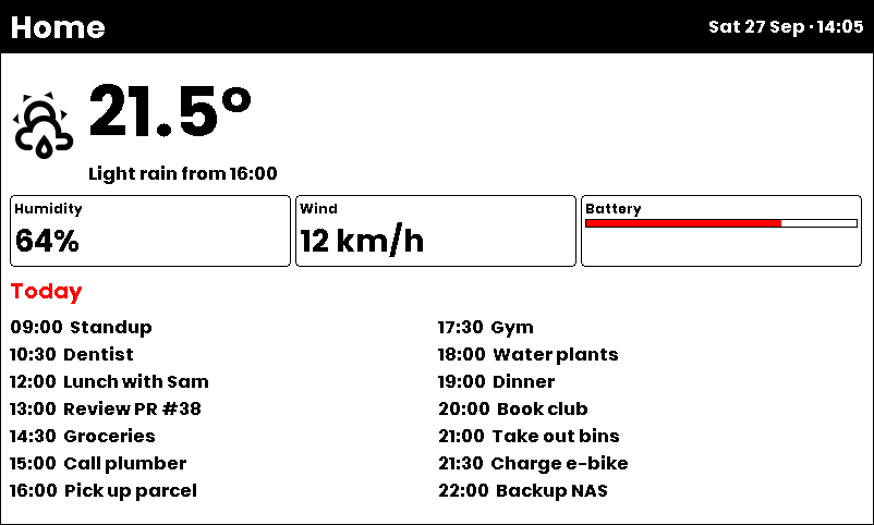
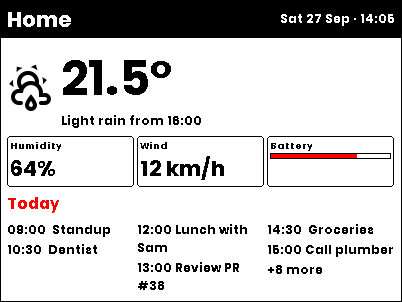
One payload, two displays. Nothing in it is positioned by hand. On the small screen the text shrinks, the calendar wraps into narrower columns and reports what didn't fit. It also renders at 1972 × 1404 and 1200 × 1600.


- Containers:
row,column,stack,gridandlist, with gaps, padding, alignment andgrow - Content-aware: text is measured with the renderer's own fonts, wrapped and clamped to fit its box
- Resolution-independent: size tokens (
sm,md,lg, …) scale with the display - Lists that fit:
listpicks the best column count and shows "+N more" for what doesn't fit - Plain ODL out: the output is an ordinary element list you can print, diff and hand-edit
- Mix freely: containers and hand-placed elements can share one payload
uv add odl-layout
# or
pip install odl-layoutimport asyncio
from odl_layout import layout
from odl_renderer import generate_image
payload = [
{
"type": "column",
"padding": "md",
"gap": "sm",
"children": [
{"type": "text", "value": "21.5°", "size": "xxl"},
{"type": "text", "value": "Light rain from 16:00"},
{"type": "progress_bar", "progress": 72, "h": "md", "fill": "red"},
],
}
]
async def main():
elements = layout(payload, 800, 480) # plain ODL, positioned for 800x480
image = await generate_image(width=800, height=480, elements=elements)
image.save("output.png")
asyncio.run(main())layout() is synchronous but reads font files. In async code, run it in an executor.
| Container | Use it for |
|---|---|
column |
Stacking things top to bottom |
row |
Putting things side by side |
stack |
Layering things on top of each other, or free placement in a box |
grid |
Equal tiles in a fixed number of columns |
list |
Many similar items that may not all fit |
spacer |
Pushing neighbours apart |
Anything that isn't a container is a regular ODL element, placed by its parent. Leave out its position fields; layout fills them in.
Every node, container or element, accepts:
| Field | Default | Notes |
|---|---|---|
w, h |
content | Pixels, "50%" of the parent's inner box, or auto |
grow |
0 |
Takes a share of the leftover space; grow: 2 gets twice as much as grow: 1 |
align_self |
parent's | Overrides the parent's align for this node |
Sizes are w / h rather than width / height because many ODL elements already use width for line thickness.
size (text and icons), gap, padding and radius accept tokens that scale with the display's short side:
| Token | Text small / medium / large | Spacing small / medium / large |
|---|---|---|
xs |
9 / 12 / 24 | 2 / 2 / 4 |
sm |
12 / 16 / 32 | 3 / 4 / 8 |
md |
15 / 20 / 40 | 6 / 8 / 16 |
lg |
21 / 28 / 56 | 9 / 12 / 24 |
xl |
30 / 40 / 80 | 12 / 16 / 32 |
xxl |
48 / 64 / 128 | 18 / 24 / 48 |
small: short side ≤ 300 px (e.g. 400 × 300) · medium: ≤ 600 px (e.g. 800 × 480) · large: bigger
(e.g. 1972 × 1404, 1200 × 1600). Plain numbers are always pixels. Text without a size uses md.
A container at the top level of the payload fills the whole canvas. To give it a region instead:
| Field | Notes |
|---|---|
x, y |
Top-left corner, pixels or "%" of the canvas |
w, h |
Size; auto shrinks to the content |
right, bottom |
Distance from the canvas edge, instead of w / h |
Containers nested inside other containers are placed by their parent.
| Field | Notes |
|---|---|
padding |
One value, [vertical, horizontal] or [top, right, bottom, left] |
background |
Fill color behind the container |
border |
Outline color |
border_width |
Outline thickness (default 1) |
radius |
Corner radius |
Stacks children from top to bottom. Children are as wide as the column unless align says otherwise.
| Field | Default | Notes |
|---|---|---|
children |
— | Nodes to stack |
gap |
0 |
Space between children |
justify |
"start" |
Vertical: "start", "center", "end", "space-between" |
align |
"stretch" |
Horizontal: "start", "center", "end", "stretch" |
- type: column
  x: 16
  y: 16
  w: 70%
  h: auto
  padding: md
  gap: sm
  border: black
  radius: sm
  children:
    - type: text
      value: Living room
      size: lg
    - type: text
      value: 21.5° · 48% humidity
    - type: progress_bar
      progress: 64
      h: md
      fill: red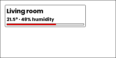
Places children side by side. Use grow to let a child take the remaining width.
| Field | Default | Notes |
|---|---|---|
children |
— | Nodes to place |
gap |
0 |
Space between children |
justify |
"start" |
Horizontal: "start", "center", "end", "space-between" |
align |
"center" |
Vertical: "start", "center", "end", "stretch" |
- type: column
  padding: md
  gap: md
  children:
    - type: row
      gap: md
      children:
        - type: icon
          value: thermometer
          size: xl
        - type: text
          value: Outside
          grow: 1
        - type: text
          value: 12.4°
          size: xl
    - type: row
      gap: md
      children:
        - type: icon
          value: water-percent
          size: xl
        - type: text
          value: Humidity
          grow: 1
        - type: text
          value: 81%
          size: xl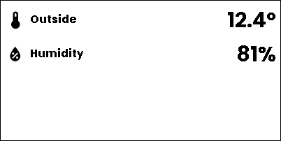
Layers children on top of each other in the same box. By default each child fills the box. A child with
position: absolute is placed at its own x / y inside the box, which is handy for badges and corner labels.
| Field | Default | Notes |
|---|---|---|
children |
— | Nodes to layer, first one at the bottom |
align |
"stretch" |
Horizontal: "start", "center", "end", "stretch" |
valign |
"stretch" |
Vertical: "start", "center", "end", "stretch" |
Children can override the stack with align_self / valign_self. Absolute children take x, y (pixels or "%"
of the stack), and optionally w and h.
- type: stack
  x: 10%
  y: 10%
  w: 80%
  h: 80%
  align: center
  valign: center
  border: black
  radius: md
  children:
    - type: text
      value: Front door is open
      size: lg
    - type: text
      value: 3 min
      size: sm
      color: red
      position: absolute
      x: 8
      y: 6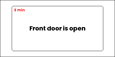
Splits the width into equal columns and fills them row by row. Rows stretch to fill the grid's height, so tiles line up.
| Field | Default | Notes |
|---|---|---|
children |
— | Nodes to place in the cells |
cols |
1 |
Number of columns |
gap |
0 |
Space between cells, both directions |
A child with span: 2 takes two cells in its row.
- type: grid
  cols: 3
  gap: sm
  padding: sm
  children:
    - type: column
      padding: sm
      border: black
      children:
        - {type: text, value: Solar, size: xs}
        - {type: text, value: 14.2 kWh, size: lg}
    - type: column
      padding: sm
      border: black
      children:
        - {type: text, value: Grid, size: xs}
        - {type: text, value: 3.1 kWh, size: lg}
    - type: column
      padding: sm
      border: black
      children:
        - {type: text, value: Battery, size: xs}
        - {type: text, value: 86%, size: lg}
    - type: column
      span: 2
      padding: sm
      background: black
      children:
        - {type: text, value: Consumption, size: xs, color: white}
        - {type: text, value: 9.8 kWh, size: lg, color: white}
    - type: column
      padding: sm
      border: black
      children:
        - {type: text, value: Car, size: xs}
        - {type: text, value: 42%, size: lg}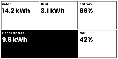
Flows items top to bottom, then into the next column. Items that don't fit are left out; with overflow_counter
the list says how many.
| Field | Default | Notes |
|---|---|---|
items |
— | Nodes to list |
max_cols |
1 |
Uses up to this many columns, whichever shows the most items |
cols |
— | Always use exactly this many columns (instead of max_cols) |
gap |
0 |
Space between items and columns |
overflow_counter |
false |
Add a line for the hidden items |
overflow_text |
"+{n} more" |
Counter text; {n} is the number hidden |
overflow_size |
"sm" |
Counter text size |
- type: list
  padding: md
  max_cols: 2
  gap: xs
  overflow_counter: true
  items:
    - {type: text, value: "09:00  Standup"}
    - {type: text, value: "10:30  Dentist"}
    - {type: text, value: "12:00  Lunch with Sam"}
    - {type: text, value: "13:00  Review PR"}
    - {type: text, value: "14:30  Groceries"}
    - {type: text, value: "15:00  Call plumber"}
    - {type: text, value: "16:00  Pick up parcel"}
    - {type: text, value: "17:30  Gym"}
    - {type: text, value: "18:00  Water plants"}
    - {type: text, value: "19:00  Dinner"}
    - {type: text, value: "20:00  Book club"}
    - {type: text, value: "21:00  Take out bins"}
    - {type: text, value: "22:00  Backup NAS"}
    - {type: text, value: "23:00  Lights off"}
    - {type: text, value: "23:30  Lock doors"}
    - {type: text, value: "07:00  Alarm"}
    - {type: text, value: "07:30  Feed cat"}
    - {type: text, value: "08:00  Bus"}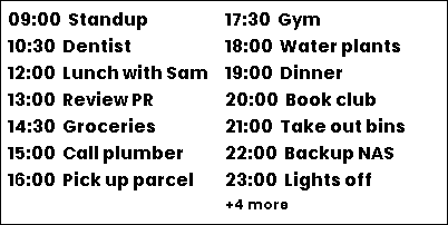
An empty node with grow: 1. In a row or column it pushes its neighbours apart.
- type: column
  padding: md
  children:
    - type: text
      value: Next bin collection
      size: lg
    - type: spacer
    - type: row
      children:
        - type: text
          value: Paper
          size: xl
        - type: spacer
        - type: text
          value: Tomorrow
          size: xl
          color: red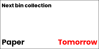
These ODL elements can be placed by a container: text, multiline, icon, icon_sequence, qrcode, dlimg,
rectangle, ellipse, progress_bar, plot, line, circle, arc and polygon. Their position fields are
filled in from the box they get. Shapes like rectangle and progress_bar have no natural size, so give them
w / h or grow.
A few element fields behave differently inside a container:
| Element | Field | Notes |
|---|---|---|
text |
clamp |
Maximum number of lines; the last one ends in ... |
text |
truncate |
Keep to one line, ending in ... |
text |
align |
"center" or "right" aligns the text within its box |
line |
vertical |
true draws a vertical divider, e.g. between items in a row |
polygon |
points |
Relative to the box; "%" values refer to the box size |
Text with parse_colors is measured but not wrapped. diagram, debug_grid and rectangle_pattern only work at
the top level of the payload.
Containers and hand-placed elements can share one payload:
- Order is paint order. Each container is replaced, in place, by the elements it lays out.
- Top-level elements are left alone. They keep their own coordinates and layout doesn't avoid them.
- Inside a container, layout decides positions. Any
x/yset on a child is replaced (with a warning). To place something freely inside a region, use astackwith an absolute child. - Auto-stacking continues below a container. A
text,multilineorlinewithoutythat follows a container starts below it. Give the containerh: autoso it doesn't take the whole canvas. - Hidden children take no space.
visible: falseremoves the child and its gap.
Template values are filled in before layout runs, so text is measured with the real sensor values. Call
layout() with the canvas size after rotation, right before rendering:
elements = await hass.async_add_executor_job(layout, payload, width, height, font_dirs)
image = await generate_image(width=width, height=height, elements=elements, font_dirs=font_dirs)uv sync --all-extras
uv run pytest
uv run prek run --all-files # ruff, ruff-format, mypy
uv run python scripts/generate_screenshots.pyScreenshots are rendered from the YAML examples in this README and from
docs/examples/dashboard.yaml.